<div class="section-full p-5 bg-white mobile-page-padding">
    <div class="container">
        <div class="section-content">
            <div class="row">
                <div class="col-md-5 col-sm-6">
                    @Partial.Translate("Hakkımızda", lang)
                </div>
                <div class="col-md-7 col-sm-6">
                    <div class="video-section-full-v2">
                        <div class="video-section-full bg-no-repeat bg-cover overlay-wraper m-b30" style="background-image:url( @Partial.Translate("HakkımızdaGorsel", lang))">
                            <div class="overlay-main bg-black opacity-04"></div>
                            <div class="video-section-inner">
                                <div class="video-section-content">
                                    <div class="video-section-left">
                                        <a data-fancybox href="https://www.youtube.com/watch?v=MV4oC_cjtRc" class="mfp-video play-now">
                                            <i class="icon fa fa-play"></i>
                                            <span class="ripple-2"></span>
                                        </a>
                                    </div>
                                </div>
                            </div>
                        </div>
                    </div>
                </div>
            </div>
        </div>
    </div>
</div>
/Upload/File/2019/12/4/karayeltanitimfilmi1.jpg
<div class="m-about-containt text-black">
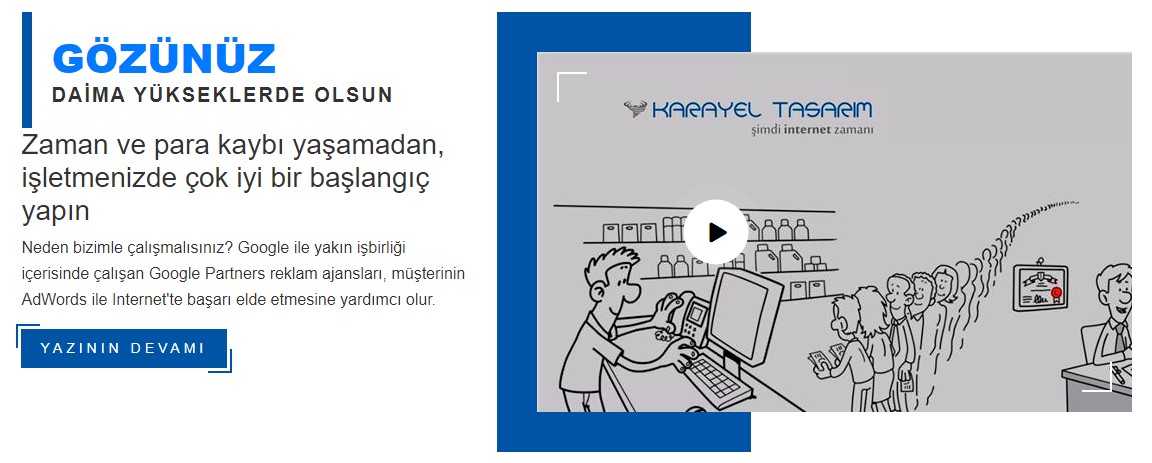
<div class="m-about-years bg-moving" style="background-image:url(images/background/line.png);"><span class="text-primary large-title">GÖZÜNÜZ</span> <span class="large-title-info">Daima Yükseklerde Olsun</span></div>
<h3 class="font-weight-600">Bu alan TRANSLATE alanından gelmektedir.</h3>
<p>Bu companent 4 çeşittir. (1) Image and Info, (2) Youtube and Info, (3) Image and Info Right, (4) Youtube and Info Left makalelerini inceleyerek görebilirsiniz.</p>
<div class="author-info p-t20"><a class="site-button btn-effect m-b15" href="/tr/kurumsal.html"><span>Yazının Devamı</span></a></div>
</div>
/*-----------------------
	video part
-------------------------*/

.video-section-full-v2{
	position:relative;
	z-index:1;
	margin-top: 40px;
	margin-bottom: 70px;
}
.video-section-full-v2:after{
	position:absolute;
	content:'';
	left:0px;
	top:-40px;
	width:40%;
	height:calc(100% + 80px);
	background-color:#0054a6;
	z-index:-1;
}
.video-section-full{
	padding: 60px 40px;
	position: relative;
	z-index: 1;
	overflow: hidden;
	bottom: -120px;
	margin-top: -100px;
}

.video-section-full-v2 .video-section-full{
	padding: 150px 40px;
	position: relative;
	z-index: 1;
	overflow: hidden;
	bottom:0px;
	margin-top: 0px;
	margin-left:40px;
}


.video-section-full .overlay-main{
	z-index:-1;
}
.video-section-full:after,
.video-section-full:before,
.video-section-inner:after,
.video-section-inner:before{
	content:"";
	position:absolute;
	background-color:#fff;

	-webkit-transition: all .5s ease-in-out;
	-moz-transition: all .5s ease-in-out;
	-ms-transition: all .5s ease-in-out;
	-o-transition: all .5s ease-in-out;
	transition: all .5s ease-in-out;
	overflow:hidden;
}
.video-section-full:after{
	width:30px;
	height:2px;
	left:20px;
	top:20px;
}
.video-section-full:before{
	width:2px;
	height:30px;
	left:20px;
	top:20px;
}
.video-section-full:hover:after{
	width:100%;
}
.video-section-full:hover:before{
	height:100%;
}


.video-section-inner:after{
	width:30px;
	height:2px;
	right:20px;
	bottom:20px;
}
.video-section-inner:before{
	width:2px;
	height:30px;
	right:20px;
	bottom:20px;
}
.video-section-full:hover .video-section-inner:after{
	width:100%;
}
.video-section-full:hover .video-section-inner:before{
	height:100%;
}


.video-section{
	position:relative;
	z-index:1;
	margin-right: 31px;
}
.video-section-content{
	display: table;
	padding: 30px 0px;
	width:100%
}
.video-section-left{
	position:relative;
	display:table-cell;
	vertical-align:middle;
	width:120px;
}
.video-section-right{
	display:table-cell;
	vertical-align:middle;
	text-align:right;
}
.video-section-right a{
	color:#fff;
}
.video-section-right a:hover{
	color:#0054a6;
}

.video-section-left .play-now{
	position: absolute;
	left: 27%;
	top: 50%;
	display: block;
	border-radius: 50%;
	z-index: 10;
	width: 60px;
	height: 60px;
	-webkit-transform: translateX(-50%) translateY(-50%);
	transform: translateX(-50%) translateY(-50%);
	transform-origin: center center;
}

@media only screen and (max-width:991px) {
.video-section-full{
	padding: 60px 40px;
	bottom: 0px;
	margin-top: 0px;
	margin-bottom:30px;
}
}
@media only screen and (max-width: 480px) {
	.video-section-full{
		width:100%;
		margin-bottom:15px;
	}
.video-section-full-v2 .video-section-full{
	margin-left:0px;
}

}

/*____About us
=========================*/

.m-about {
	position: relative;
	z-index: 2;
}

.m-about:after {
	content: "";
	position: absolute;
	width: 75%;
	height: 75%;
	background-color: #0054a6;
	left: 0px;
	top: 18%;
	z-index: -1;
}

.m-about-years{
	display: inline-block;
	padding: 20px;
	border-left: 10px solid #0054a6;
}

.m-about .item {
	-webkit-box-shadow: 0 10px 40px 0 rgba(0, 0, 0, 0.4);
	box-shadow: 0 10px 40px 0 rgba(0, 0, 0, .0.4);
	margin: 50px;
}
.large-title-info{
	font-size: 20px;
	text-transform: uppercase;
	font-weight: 700;
	letter-spacing: 2px;
	display: block;
}
@media only screen and (max-width:767px) {
	.m-about {
		margin: 0px 0px 0px 50px;
	}
	.m-about-containt {
		margin-top: 60px;
	}
}

.m-about-containt .large-title{
font-size:56px;
	font-weight:900;
	display:inline-block;
	line-height: 50px;
}

@media only screen and (max-width:480px) {
	.m-about-containt h1,
	.m-about-containt h2,
	.m-about-containt h3{
		font-size: 22px;
		line-height:inherit;
	}
}

/*____animated play btn
======================================*/


/*____ANIMATED PLAY BTN____*/

.play-now{
  position: absolute;
  left: 50%;
  top: 50%;
  display: block;
  border-radius: 50%;
  z-index:10;
  width:60px;
  height:60px;
  -webkit-transform: translateX(-50%) translateY(-50%);
  transform: translateX(-50%) translateY(-50%);
  transform-origin: center center;
}

.play-now .icon{
    position: absolute;
    left: 50%;
    top: 50%;
    height: 65px;
    width: 65px;
    text-align: center;
    line-height: 65px;
    background-color: #fff;
    color: #000;
    z-index: 1;
    font-size: 20px;
    padding-left: 5px;
    display: block;

  -webkit-transform: translateX(-50%) translateY(-50%);
  transform: translateX(-50%) translateY(-50%);
  -webkit-transform-origin:center;
  transform-origin: center center;

    -webkit-border-radius: 50%;
    -moz-border-radius: 50%;
    -ms-border-radius: 50%;
    -o-border-radius: 50%;
    border-radius: 50%;
    -webkit-box-shadow: 0 5px 10px 0 rgba(255, 255, 255, 0.1);
    -moz-box-shadow: 0 5px 10px 0 rgba(255, 255, 255, 0.1);
    -ms-box-shadow: 0 5px 10px 0 rgba(255, 255, 255, 0.1);
    -o-box-shadow: 0 5px 10px 0 rgba(255, 255, 255, 0.1);
    box-shadow: 0 5px 10px 0 rgba(255, 255, 255, 0.1);

}

.play-now .ripple-2,
.play-now .ripple-2:before,
.play-now ripple-2:after {
    position: absolute;
    top: 50%;
    left: 50%;
    height: 65px;
    width: 65px;

  -webkit-transform: translateX(-50%) translateY(-50%);
  transform: translateX(-50%) translateY(-50%);
  -webkit-transform-origin:center;
  transform-origin: center center;

    -webkit-border-radius: 50%;
    -moz-border-radius: 50%;
    -ms-border-radius: 50%;
    -o-border-radius: 50%;
    border-radius: 50%;

    -webkit-box-shadow: 0 0 0 0 rgba(255, 255, 255, .3);
    -moz-box-shadow: 0 0 0 0 rgba(255, 255, 255, .3);
    -ms-box-shadow: 0 0 0 0 rgba(255, 255, 255, .3);
    -o-box-shadow: 0 0 0 0 rgba(255, 255, 255, .3);
    box-shadow: 0 0 0 0 rgba(255, 255, 255, .3);

    -webkit-animation: ripple-2 3s infinite;
    -moz-animation: ripple-2 3s infinite;
    -ms-animation: ripple-2 3s infinite;
    -o-animation: ripple-2 3s infinite;
    animation: ripple-2 3s infinite;
}

.play-now .ripple-2:before {
    -webkit-animation-delay: .9s;
    -moz-animation-delay: .9s;
    -ms-animation-delay: .9s;
    -o-animation-delay: .9s;
    animation-delay: .9s;
    content: "";
    position: absolute;

}

.play-now .ripple-2:after {
    -webkit-animation-delay: .6s;
    -moz-animation-delay: .6s;
    -ms-animation-delay: .6s;
    -o-animation-delay: .6s;
    animation-delay: .6s;
    content: "";
    position: absolute;

}

@-webkit-keyframes ripple-2 {
    70% {box-shadow: 0 0 0 20px rgba(255, 255, 255, 0);}
    100% {box-shadow: 0 0 0 0 rgba(255, 255, 255, 0);}
}

@keyframes ripple-2 {
    70% {box-shadow: 0 0 0 20px rgba(255, 255, 255, 0);}
    100% {box-shadow: 0 0 0 0 rgba(255, 255, 255, 0);}
}

.slider-play-icon .play-now{
	right:30%;
	left:auto;
	top:45%;
}


/*====site button effect====*/

.btn-effect {
  letter-spacing:4px;
  position:relative;
  text-transform:uppercase;
}

.btn-effect:before,
.btn-effect:after {
  border-color: transparent;
  -webkit-transition: all 0.25s;
  transition: all 0.25s;
  border-style: solid;
  border-width: 0;
  content: "";
  height: 24px;
  position: absolute;
  width: 24px;
}

.btn-effect:before {
  border-color: #c47135;
  border-left-width: 2px;
  border-top-width: 2px;
  left: -5px;
  top: -5px;
}

.btn-effect:after {
  border-color: #c47135;
  border-bottom-width: 2px;
  border-right-width: 2px;
  bottom: -5px;
  right: -5px;
}

.site-button.btn-effect:before, .site-button.btn-effect:after {
    border-color: #0054a6;
}

.btn-effect:hover:before,
.btn-effect:hover:after{
  height: 100%;
  width: 100%;
}

.btn {
	padding-top: 9px;
	padding-bottom: 9px;
}

.site-button,
.site-button-secondry {
	padding: 10px 20px;
	display: inline-block;
	font-size: 14px;
	outline: none;
	cursor: pointer;
	outline: none;
	border-width: 0;
	border-style: solid;
	border-color: transparent;
	line-height: 1.42857;
	margin-left: -1px;
	text-decoration: none !important;
}

.site-button {
	background-color: #0054a6;
	color: #fff;
}

.site-button:active,
.site-button:hover,
.site-button:focus,
.active>.site-button {
	background-color: #0054a6;
	color: #fff;
}

.site-button:hover {
	background-color: #222;
	color: #fff;
}

.site-button-secondry {
	background-color: #222;
	color: #fff;
}

.site-button-secondry:active,
.site-button-secondry:hover,
.site-button-secondry:focus,
.active>.site-button-secondry {
	background-color: #222;
	color: #fff;
}

.m-b15 {
    margin-bottom: 15px;
}
www.karayeltasarim.com
Sosyal Ağ